What is Data Visualization?
Data visualization is a hot topic in the marketing arena right now. The consensus is that more information is being produced every day, and the only way to get a true understanding of it is through visuals. Rather than just talking about data trends or how one business is compared to another, businesses use different charts and graphs to get their message across better.
Data visualization is a process of viewing data, so it is easily understood. Data visualization can be done on paper, digital, or a combination of both. If you want to make data more appealing, you need to be able to visualize it. Data visualization takes raw data and turns it into a graphic or image, either static or interactive. Many industries use the process for many purposes. For example, data visualization can find patterns within datasets, show trends, identify relationships between variables, etc.
What is the best way to Visualize How data visualization can supersize results?
Data is everywhere. It’s in our inboxes, on our social media feeds, and in the media. Companies around the world are also using data to come up with new ways to grow their businesses. Turning data into information is one process. Turning that information into knowledge is another. And finally, turning that knowledge into wisdom is another feat altogether. That transformation happens when you visualize data effectively, especially to make it more comprehensible. In this post, we will cover some of the most important techniques for visualizing your data so that others can understand what they are seeing. We will start with a brief introduction about how data visualization works before exploring different methods of making sense of large amounts of numbers and statistics. Finally, we will wrap things up by looking at four specific case studies where these principles have been used.

How do Visualizations Work?
Visualization is often described as “the art or science of representing complex ideas through simple graphics.” In other words, it involves using shapes, colors, lines, text, images, etc., to convey certain messages or concepts. The goal here is to communicate something quickly without having to explain everything verbally. This helps people who may not be familiar with the topic better grasp its meaning.
The idea behind visualization was first introduced by Edward Tufte way back in 1982. He believed graphs effectively presented numerical data to show trends, patterns, and relationships between variables easily. By combining charts, tables, and maps, he wanted to help users understand statistical results. Today, many tools are available online that allow us to create beautiful visuals from raw data sets.
A great example of where data visualization supersizes results is in the medical industry. Doctors can quickly and easily see how many patients they’ve seen, how long they’ve been working, and where they need to focus next to ensure they’re meeting their quota. It really helps them focus on what needs to be done. Another example is retail stores. Data visualization can help them see what products are selling, what deals are working, and how effective their marketing is.

How Does Graph Theory Help Us Solve Problems Today?
Graph theory has been around for quite some time now. Many years ago, mathematicians tried to solve problems by using math formulas. However, this method was not efficient enough because these formulas took too long to calculate. So, instead of solving mathematical equations with numbers, scientists used graphs to work out solutions. Nowadays, we still need to work with graphs, but we have more advanced ways of doing things than just graphing them manually.
Why Are Graphs Important?
We live in a world full of complex systems. Every day, we come across situations that require us to figure out if the system works correctly. To do this, you must know exactly what’s going on inside your system. You’ll never truly get a good idea unless you visualize everything happening within your system. That’s why graphs are important. If you want to start learning about data visualization, there are plenty of resources online. Try searching for “data visualizations” on YouTube, Reddit, Quora, Twitter, etc.
But if I said “Go get me two pizzas” without telling him specifically what kind of pizza I wanted, he wouldn’t know anything about what I meant.
The History of Graphs
The history of graphs goes back thousands of years ago when ancient civilizations first started developing tools like maps and charts. They would make simple diagrams showing how landmasses fit together. These early maps also showed roads and rivers, which helped merchants find new routes. Later on, during the Renaissance era, Leonardo da Vinci developed his own version of a map called an _atlas_. He drew lines connecting cities and towns along the coastlines of Europe.
There are also different ways to represent numbers besides just using percentages. An area chart shows the total amount of each category. For instance, this could show sales by month for last year’s quarter. The bars would tell you how much was sold during those months. If there were two categories with equal amounts being sold, then your bar charts might look like:
Another way to view data is through frequency distribution. Frequency distributions show the number of occurrences of values within an interval. In other words, if I had 10 companies all making 10 million dollars per year, my histogram might look something like this:
If we wanted to know which company made more money than others, we’d have to calculate the average value from our frequency distribution. So let’s say that Company 1 makes 12 billion dollars while Company 2 only has 9 billion. We want to find out who earned more than the rest so that we can compare these earnings. To do this, first, figure out the sum of every single dollar listed above. Then divide this sum by the total number of companies. In this case, we multiply 12 billion by 20 because there are 20 companies. Next, take the square root of this result. Finally, round down so that the answer ends up as close to 0 as possible.

What are the two basic types of data visualization?
Data visualization is the process of representing one or more quantitative variables graphically to help understand the patterns or relationships. Visualizations are then usually presented in detail. There are two basic types of data visualization, visualization by category and visualization by time progression. An example of visualization by category is a pie chart, which shows the relative contribution to the whole of the data being shown by each category. An example of visualization by time progression is a line graph, which shows the change in the data over time.
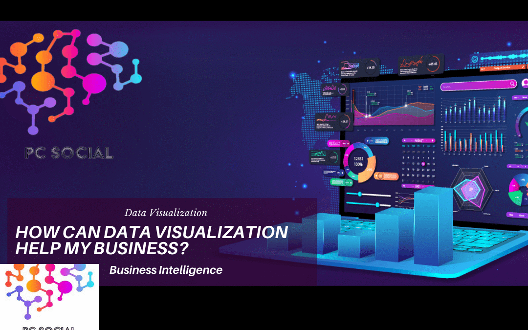
The most common visualization tool used today for business intelligence applications is called a “dashboard.” Dashboards typically consist of multiple graphical displays on a single screen that present information about some aspect of performance within an organization at a point-in-time view. They can be considered static snapshots of organizational performance taken periodically throughout the execution of selected processes such as financial reporting, manufacturing planning, sales forecasting, etc. This approach has been adopted widely because it provides quick access to key metrics from different sources in real-time without navigating through numerous reports. As a result, dashboards have become ubiquitous in modern organizations, where they serve as primary tools for monitoring and managing operations across all levels of management.
Which data visualization tools are good for someone who is just starting at data visualization?
If you’re starting at data visualization, perhaps you require some data visualization tools. It seems that there are many tutorials and tools out there to help with this process, but which ones are best for you? One way to start would be to identify the type of data you are trying to visualize. For example, are you looking to map natural disasters, or are you trying to understand product pricing? There are many styles of data visualization that can be helpful in both scenarios. If you’re looking for a way to track natural disasters, bubble maps are one of the most popular data visualization styles. This type of map breaks down information about an event by the frequency it occurs. The following list includes several popular data visualization tools:
Tableau Software – Tableau provides a suite of business analytics software products for visualizing large amounts of complex data. The company’s flagship tool is Tableau Desktop, an easy-to-use interactive dashboard creation application used by more than 2 million users worldwide.
Adobe Sparklines – Adobe Sparkline is a free online service for creating sparklines from your web pages. You can create simple line graphs using HTML5 canvas elements on any website. With no coding required, it’s quick and painless.
Google Fusion Tables – Google offers a powerful set of tools called “FusionTables” that allows anyone to easily import their own data into maps, charts, and tables, along with other features such as editing layers, custom colors, etc.
Microsoft Power BI – Microsoft recently released its new platform, PowerBI.com, which allows people to quickly build beautiful dashboards powered by big data sets without having Once you have identified what kind of data you want to visualize, it’s time to think about how you can get started on your project. You may already know a lot about the subject, but if not, then you will probably find yourself searching online for information.
How do we know which visualizations work best for our audience?
Have you ever watched a great TV show and wondered how they knew exactly what to include in each episode? They had to know what they wanted to say, how they wanted to say it, what the audience would care about, and how the story would develop. Well, when it comes to data visualization, it is no different. It would help if you thought about each of these elements before you begin creating your visualizations. As with any other form of storytelling, if you don’t know what you want to communicate first, the chances are that your viewers won’t either! This article will help you get started on thinking through all four aspects of effective data visualization: content, design, context, and communication.
Content
The most important part of any piece of media is its content. If there isn’t anything new or interesting to convey in your work, then why should anyone watch/read it? This section will look at ways to ensure that your data has something useful to tell us. We’ll also discuss how to choose which pieces of information are worth communicating.
In many cases, choosing which parts of your dataset to visualize can be as simple as asking yourself whether those bits of data add value to the overall message being communicated. For example, let’s take a look at Figure 1-1 below. It shows the number of people who police officers arrested across New York City between 2001 and 2010. The top graph shows arrests per year from 2001–2010, while the bottom one shows arrests per month over the same time period. What does this figure mean? Does seeing the monthly totals give us any additional insight into crime trends? Is looking at the yearly totals enough? Should we even see both sets of numbers together? These are questions you must ask yourself before deciding which data points to share.
Design
Once you’ve decided what you’re trying to communicate, you’ll need to consider what kind of presentation style works best for your audience. Do you prefer text descriptions, images, graphs, maps, charts, diagrams, animations, videos? How many details do you feel comfortable sharing? And finally, where should your data visualization sit within the larger body of your content? These decisions affect everything else around them—from font size and color choices to the type of animation used.
Context
Finally, once you decide what to present and how you’ll need to understand the world in which your users live. Are they using your visualization right now? Have they seen similar visuals elsewhere? Knowing their context helps you create work that resonates with them.
Communication
You might not always realize it, but your goals influence every aspect of your project. So far, we’ve discussed the importance of having clear objectives and considering your audience, but it doesn’t end here. Once you start working on your projects, you’ll need to keep track of your progress so that you can evaluate whether your ideas are coming true. Here are three tips for keeping track of things along the way.
Keep Your Vision Clear
As mentioned earlier, having a good vision for your project will allow you to focus on making it happen. But sometimes, our visions change as our plans evolve. Keeping your vision clearly defined will prevent you from getting distracted by side issues. To achieve clarity, try writing down your initial thoughts and brainstorming possible solutions. Then reevaluate your original plan based on feedback from others and adjust accordingly.
Get Feedback Early On
There may come the point during development when you find out that your assumptions aren’t correct. Or maybe you discover that your target audience needs more than what was originally planned. Whatever happens, you’ll probably benefit from knowing sooner rather than later because it gives you time to adapt to changing circumstances. One thing I learned early on is that it takes several iterations to perfect a final product. Don’t worry too much if your initial concept falls short of perfection. Instead, use it as inspiration for future versions.
Measure Success Along the Way To measure success, you don’t necessarily have to wait until after completion. In fact, measuring your results throughout the process allows you to make adjustments along the way. If something isn’t working well or looks wrong, fix it! As long as you’re improving your design, you’re doing fine. Remember: there’s never really an “end” to designing.
The Importance Of Data Visibility When people talk about big data problems like climate change or healthcare costs, it often seems that those who hold power over decision-making processes are aware of all the available information. However, most organizations still struggle to get access to this valuable resource. This leaves us wondering why some companies seem better at gathering and analyzing data while others remain stuck in the dark ages. It turns out that one key difference between successful data visualization teams and unsuccessful ones lies in invisibility.
Visibility is Key
If you want to see the full picture, then you must be visible. That means being able to share your insights with everyone involved in the process. When data visualization teams fail to reach a consensus, they usually blame someone else. The truth is, however, that the problem actually stems from the lack of transparency. Without shared understanding, members of a team cannot truly collaborate effectively.
Data visualization is a hot topic in the marketing arena right now. The consensus is that more information is being produced every day, and the only way to get a true understanding of it is through visuals. Rather than just talking about data trends or how one business is compared to another, businesses use different charts and graphs to get their message across better. Data visualizations aren’t just for business use; they also have a lot of potential in education. Students could visualize their school grades by class or individual subjects to know which students are having trouble with certain subjects. Teachers could analyze test scores using different colors to show whether kids struggle with math but do well in science. Or, if you want to get into some serious fun, try creating an interactive dashboard showing your favorite sports teams’ performance over time.
Our team here at PC Social is a data visualization company that helps business owners and marketers understand the motivations and lifestyles of their customers. The company will analyze your data and create visualizations that will captivate your audience. Your audience engagement will be 10x better than before. You can share your unique experience and stories related to data with your key stakeholders and customers. We can assist you in learning more about your business and customers.
2 Comments
The Importance of Social Business Intelligence for Business Success in the 21st Century -
April 10, 2023[…] can be leveraged to make more informed decisions. Self-service BI tools enable end users to create data visualizations and develop dashboards independently without needing a background in technical skills or […]
Business Intelligence: The Aftermath of The Pandemic Using Business Insights
March 11, 2022[…] to extract meaning from enormous amounts of data. BA tools allow users to explore, analyze, and visualize data using statistical methods. One example of this would be the use of predictive models to predict […]